Custom Layout
The default layouts that are normally used with a content item will rarely be
sufficient for all of the App scenarios. For example, the default Card layout
that is available out of the box is a good start but may not be applicable for
all pages of the app. In some cases, you would want an enlarged view of the same
card and in some cases a mini-view.
To cater to all of these scenarios, the Vyuh Framework allows extending a Content Item with additional layouts. In fact, any feature can provide these layouts, allowing even unrelated features to contribute to the overall list of layouts for a content item.
In this guide, let’s add a custom layout for the ProductCard item we created
in another article. If you haven’t seen the article yet, take a quick read and
come back here.
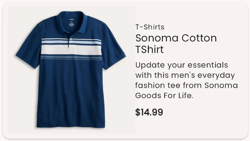
The default layout for the ProductCard item, that we created earlier, looks
like below.
We will change things up a bit and make the image come on the left and show just
the title, price and category. This will be our mini-view of the
ProductCard. Let’s get started.
1. Creating a Mini-view layout schema
Section titled “1. Creating a Mini-view layout schema”The schema that we will use to represent the mini-view layout configuration will
be a simple one. We will have a simple boolean to control whether the category
should be shown or not. Thus our schema looks like so:
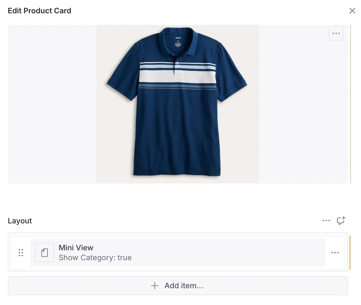
export const productMiniViewLayout = defineType({ name: `${ProductCardDescriptor.schemaType}.layout.miniView`, title: 'Mini View', type: 'object', fields: [ defineField({ name: 'showCategory', title: 'Show Category', type: 'boolean', initialValue: true, }), ], preview: { select: { showCategory: 'showCategory', }, prepare(selection) { return { title: 'Mini View', subtitle: `Show Category: ${selection.showCategory ?? false}`, } }, },})There are couple of things to note in this schema. Firstly, our schema is no
longer a simple string but a template string that uses the
ProductCardDescriptor.schemaType as its prefix. The reason why we have
switched to using a ProductCardDescriptor is partly for convention and also
because we need a custom ContentDescriptor to allow adding more layouts.
Creating the ProductCardDescriptor and ProductCardContentBuilder
Section titled “Creating the ProductCardDescriptor and ProductCardContentBuilder”The descriptor and builder for the Product content item are fairly simple as
there is no custom configuration being created. We rely on the built-in
capability of the base ContentSchemaBuilder to do all the work of assembling
layouts.
import { defineField, defineType, SchemaTypeDefinition } from 'sanity'import { IoShirt as Icon } from 'react-icons/io5'import {  ContentDescriptor,  ContentSchemaBuilder,} from '@vyuh/sanity-schema-core'
// Descriptorexport class ProductCardDescriptor extends ContentDescriptor {  static schemaType = 'misc.productCard'
  constructor(props: Partial<ContentDescriptor> = {}) {    super(ProductCardDescriptor.schemaType, props)  }}
// Schema builderexport class ProductCardContentBuilder extends ContentSchemaBuilder {  private schema = productCard // refers to the schema for the Product content item
  constructor() {    super(ProductDescriptor.schemaType)  }
  build(descriptors: ContentDescriptor[]): SchemaTypeDefinition {    return this.schema  }}
Notice that the content builder associates itself with the ProductCard using
the ProductCardDescriptor.schemaType.
2. Exporting in the FeatureDescriptor
Section titled “2. Exporting in the FeatureDescriptor”Now that we have our core elements ready, its time to export them in the
FeatureDescriptor. We do that like so:
import { defaultLayoutConfiguration, FeatureDescriptor,} from '@vyuh/sanity-schema-core'import { RouteDescriptor } from '@vyuh/sanity-schema-system'import { ProductCardContentBuilder, ProductCardDescriptor, productCardMiniViewLayout,} from './content/product-card.ts'
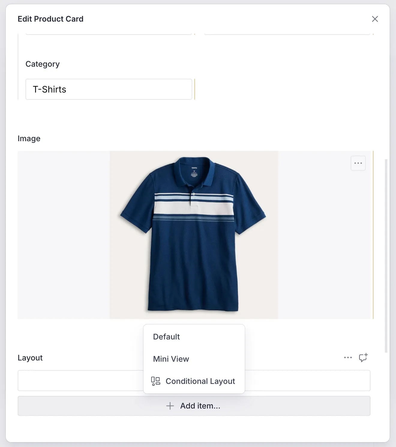
export const misc = new FeatureDescriptor({ name: 'misc', title: 'Miscellaneous', contents: [ new RouteDescriptor({ regionItems: [{ type: ProductCardDescriptor.schemaType }], }), new ProductCardDescriptor({ layouts: [ defaultLayoutConfiguration(ProductCardDescriptor.schemaType), productCardMiniViewLayout, ], }), ], contentSchemaBuilders: [new ProductCardContentBuilder()],})The main lines to notice are from 22-25, where we export the default layout
and the mini-view layout. Now we have an option to chose this layout when
creating the Product item in the CMS, as seen below.
3. Creating the Dart LayoutConfiguration
Section titled “3. Creating the Dart LayoutConfiguration”The Dart counterpart for the layout is just a type-safe version of the JSON
schema we created earlier. This can be seen below. We also see a simplified
layout of the ProductCard in the build() method.
import 'package:design_system/utils/extensions.dart';import 'package:feature_misc/content/product/product_card.dart';import 'package:flutter/material.dart';import 'package:json_annotation/json_annotation.dart';import 'package:vyuh_core/vyuh_core.dart';import 'package:vyuh_feature_system/vyuh_feature_system.dart' hide Card;
part 'mini_view_layout.g.dart';
@JsonSerializable()final class MiniViewProductCardLayout extends LayoutConfiguration<ProductCard> {  static const schemaName = '${ProductCard.schemaName}.layout.miniView';  static final typeDescriptor = TypeDescriptor(    schemaType: schemaName,    title: 'Mini View Layout',    fromJson: MiniViewProductCardLayout.fromJson,  );
  final bool showCategory;
  MiniViewProductCardLayout({this.showCategory = true})      : super(schemaType: schemaName);
  factory MiniViewProductCardLayout.fromJson(Map<String, dynamic> json) =>      _$MiniViewProductCardLayoutFromJson(json);
  @override  Widget build(BuildContext context, ProductCard content) {    final theme = Theme.of(context);
return Card( clipBehavior: Clip.antiAlias, child: Padding( padding: const EdgeInsets.all(8.0), child: Row( children: [ if (content.image != null) Padding( padding: EdgeInsets.only(right: theme.spacing.s8), child: ContentImage( ref: content.image!, width: 64, fit: BoxFit.contain, ), ), Expanded( child: Column( crossAxisAlignment: CrossAxisAlignment.start, children: [ if (showCategory) Text( content.category, style: theme.textTheme.labelSmall, ), Text( content.title, style: theme.textTheme.titleMedium?.apply(heightFactor: 0.75), ), SizedBox(height: theme.spacing.s8), Text( '\$${content.price}', style: theme.textTheme.bodyMedium?.apply(fontWeightDelta: 2), ), ], ), ), ], ), ), ); }}4. Exporting it in the feature
Section titled “4. Exporting it in the feature”By including the layout in the FeatureDescriptor, via the
ProductCardDescriptor(line 10), we can now be sure that it will be picked
up and rendered correctly.
final feature = FeatureDescriptor( name: 'misc', title: 'Misc', icon: Icons.miscellaneous_services_outlined, extensions: [ ContentExtensionDescriptor( contents: [ ProductCardDescriptor(layouts: [ DefaultProductCardLayout.typeDescriptor, MiniViewProductCardLayout.typeDescriptor, ]), ], contentBuilders: [ ProductCard.contentBuilder, ], ), ],);5. Seeing it in action
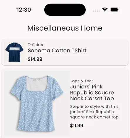
Section titled “5. Seeing it in action”Below you can see two product cards, each rendered with the mini and default layouts.
Summary
Section titled “Summary”This article showed you the way to create multiple layouts for a ContentItem.
By simply changing it on the CMS, we are able to affect the change on the App
without any special deployment. This is a hidden super power of the framework,
where you can try out different layouts without changing much of your original
code.
Under different contexts, different layouts are useful and this capability is now available to you as you build more complex applications.