Custom Content Type
Real world apps will need a variety of Content Types and its only natural that a framework like Vyuh support such a scenario. Extensibility is one of the primary qualities of this framework and in this guide we will see how to introduce a new Custom Content Type. We will add the schema on the CMS and build its implementation on Flutter.
A quick summary of all the steps are given below, with the details in the following sections:
CMS Side
Section titled “CMS Side”- Create a schema for the Content type
- Register it with the FeatureDescriptor
- Add a few instances of the new Content type for testing
Dart/Flutter Side
Section titled “Dart/Flutter Side”- Create the Dart equivalent of the content type with a custom ContentItem type
- Create its ContentBuilder that has a default LayoutConfiguration
- Register it with the FeatureDescriptor on the Dart side
- See the cards rendered live on the screen
1. A Product Card content type
Section titled “1. A Product Card content type”Cards have become one of the most prominent types of visual metaphors for real world objects. You see them everywhere in apps, in a variety of industry verticals. We will continue with that tradition and build one for ourselves as a custom card.
Let’s create a Product Card that stands for the products you would present to your customers. These could be products from the Fashion, Sports, Finance, Healthcare or any other industry. For our use case, let’s use the Fashion domain.
Defining the Schema
Section titled “Defining the Schema”The first step is to define a schema that represents a product. A typical
product would consist of the following properties: title, description,
price, category, skuId and of course an image. The following schema
captures all of this in a Sanity schema. The use of the preview field
helps in visualizing the card inside the CMS and gives the information in a
quick glance.
import { defineField, defineType } from 'sanity'import { IoShirt as Icon } from 'react-icons/io5'
export const productCard = defineType({  name: 'misc.productCard',  title: 'Product Card',  type: 'object',  icon: Icon,  fieldsets: [    {      name: 'name',      title: 'Name',      options: { columns: 2 },    },    {      name: 'details',      title: 'Product Details',      options: { columns: 2 },    },  ],  fields: [    defineField({      name: 'title',      title: 'Title',      type: 'string',      validation: (Rule) => Rule.required(),      fieldset: 'name',    }),    defineField({      name: 'description',      title: 'Description',      type: 'text',      rows: 4,      validation: (Rule) => Rule.required(),      fieldset: 'name',    }),    defineField({      name: 'skuId',      title: 'SKU Id',      type: 'string',      validation: (Rule) => Rule.required(),      fieldset: 'details',    }),    defineField({      name: 'price',      title: 'Price',      type: 'number',      validation: (Rule) => Rule.required(),      fieldset: 'details',    }),    defineField({      name: 'category',      title: 'Category',      type: 'string',      validation: (Rule) => Rule.required(),      fieldset: 'details',    }),    defineField({      name: 'image',      title: 'Image',      type: 'image',    }),  ],  preview: {    select: {      title: 'title',      price: 'price',      category: 'category',      skuId: 'skuId',      image: 'image',    },    prepare(selection) {      const { title, image, price, category, skuId } = selection      return {        title: `ProductCard | ${title} (${skuId})`,        subtitle: `${category} - $${price}`,        media: image,      }    },  },})
Exporting it in the FeatureDescriptor
Section titled “Exporting it in the FeatureDescriptor”We can now export this schema for usage inside the CMS. We do this with the
FeatureDescriptor. Notice that we are exporting it as a custom content within
the contentSchemaBuilders property and also adding to the regionItems of the
RouteDescriptor. This ensures we can add our product card to a region in the
page.
import {  BuiltContentSchemaBuilder,  FeatureDescriptor,} from '@vyuh/sanity-schema-core'import { RouteDescriptor } from '@vyuh/sanity-schema-system'import { productCard } from './content/product-card.ts'
export const misc = new FeatureDescriptor({  name: 'misc',  title: 'Miscellaneous',  contents: [    new RouteDescriptor({      regionItems: [{ type: productCard.name }],    }),  ],  contentSchemaBuilders: [    new BuiltContentSchemaBuilder({      schema: productCard,      schemaType: productCard.name,    }),  ],})
The ContentSchemaBuilder for this productCard is a simple one and does not
have any custom configurations or layouts that needs to be assembled. Hence, we
go ahead with the standard BuiltContentSchemeBuilder.
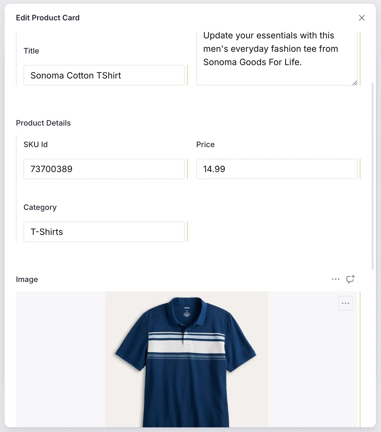
Creating a Product Card on the CMS
Section titled “Creating a Product Card on the CMS”Now that we have the schema defined, let’s add some products to our page, in the CMS. Since the Product Card has already been added to the Route’s region-items, we can see it in the list of content items for the Region.
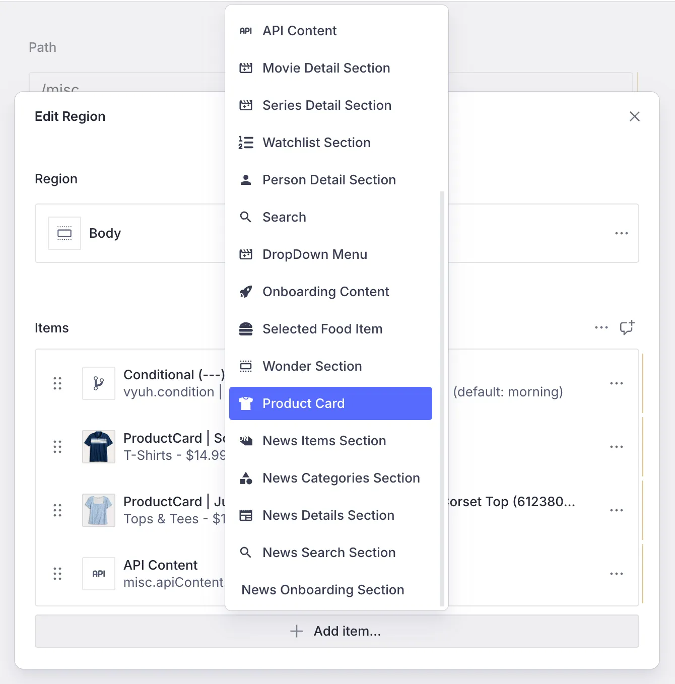
After adding some of the details of the Product, we have the card, ready to be displayed on the App.
2. Rendering the Product Card
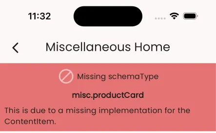
Section titled “2. Rendering the Product Card”Having an item defined on the CMS is only half the story. To render it on Flutter, we do need to create its Dart equivalent. If we fail to do so, we will be greeted with a message like below, indicating the missing piece of the Content definition.
Such a message is quite useful during development as it quickly helps in identifying the source of error. We are already aware of this missing piece, so let’s fix it now.
Building the Dart equivalent of the Schema
Section titled “Building the Dart equivalent of the Schema”The Dart version of the Product schema is the type-safe version of the JSON we get from the CMS. We can represent it like below.
import 'package:feature_misc/content/product/default_layout.dart';import 'package:json_annotation/json_annotation.dart';import 'package:vyuh_core/vyuh_core.dart';import 'package:vyuh_extension_content/vyuh_extension_content.dart';
part 'product_card.g.dart';
@JsonSerializable(createToJson: false)final class ProductCard extends ContentItem {  static const schemaName = 'misc.productCard';  static final typeDescriptor = TypeDescriptor(    schemaType: schemaName,    title: 'Product Card',    fromJson: ProductCard.fromJson,  );
  static final contentBuilder = ContentBuilder<ProductCard>(    content: ProductCard.typeDescriptor,    defaultLayout: DefaultProductCardLayout(),    defaultLayoutDescriptor: DefaultProductCardLayout.typeDescriptor,  );
  final String title;  final String description;  final ImageReference? image;  final double price;  final String skuId;  final String category;
  ProductCard({    required this.title,    required this.description,    this.image,    required this.price,    required this.skuId,    required this.category,    super.layout,  }) : super(schemaType: schemaName);
  factory ProductCard.fromJson(Map<String, dynamic> json) =>      _$ProductCardFromJson(json);}
Notice the static fields: schemaName, typeDescriptor and the
contentBuilder. These are by convention a way of keeping the meta details
about the content item together. The typeDescriptor helps in defining the way
to hydrate a Dart version of the Product from its JSON equivalent. Similarly the
contentBuilder helps in defining the creating the visual representation of the
Product. You will see these being used in the FeatureDescriptor, where we
register the Product content type.
Rendering with a LayoutConfiguration
Section titled “Rendering with a LayoutConfiguration”To render any ContentItem, we need a LayoutConfiguration that tells the
framework how to represent it in Flutter. A ContentItem can have multiple
LayoutConfiguration definitions and any feature can add more layouts for the
content type. This is one of the extensibility points of the framework.
In our case, we define a DefaultProductLayout that renders the Product with a
simple Flutter Card Widget. The code below shows this.
@JsonSerializable()final class DefaultProductLayout extends LayoutConfiguration<Product> {  static const schemaName = '${Product.schemaName}.layout.default';  static final typeDescriptor = TypeDescriptor(    schemaType: schemaName,    title: 'Product',    fromJson: DefaultProductLayout.fromJson,  );
  DefaultProductLayout() : super(schemaType: schemaName);
  factory DefaultProductLayout.fromJson(Map<String, dynamic> json) =>      _$DefaultProductLayoutFromJson(json);
  @override  Widget build(BuildContext context, Product content) {    final theme = Theme.of(context);
return Card( clipBehavior: Clip.antiAlias, child: Padding( padding: const EdgeInsets.all(8.0), child: Row( children: [ if (content.image != null) ContentImage( ref: content.image!, width: 200, ), Expanded( child: Column( crossAxisAlignment: CrossAxisAlignment.start, children: [ Text( content.category, style: theme.textTheme.labelSmall, ), Text( content.title, style: theme.textTheme.titleMedium?.apply(heightFactor: 0.75), ), Padding( padding: const EdgeInsets.symmetric(vertical: 8.0), child: Text( content.description, style: theme.textTheme.bodySmall, ), ), Text( '\$${content.price}', style: theme.textTheme.bodyMedium?.apply(fontWeightDelta: 2), ), ], ), ), ], ), ), ); }}Registering the Product Content type
Section titled “Registering the Product Content type”Just like we did on the CMS side, we also need to register this content type on
Flutter. We do this with the FeatureDescriptor in the feature.dart file
(Line #16).
import 'package:feature_misc/content/product/product_card.dart';import 'package:flutter/material.dart';import 'package:vyuh_core/vyuh_core.dart';import 'package:vyuh_extension_content/vyuh_extension_content.dart';
final feature = FeatureDescriptor(  name: 'misc',  title: 'Misc',  icon: Icons.miscellaneous_services_outlined,  extensions: [    ContentExtensionDescriptor(      contentBuilders: [        ProductCard.contentBuilder,      ],
      // ... rest of the exported elements ...    ),  ],);
3. Seeing the Products in action
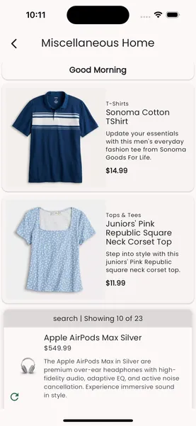
Section titled “3. Seeing the Products in action”With the schema on the CMS and its equivalent ContentBuilder created on
Flutter, we can now see it rendered in our App. It uses the default layout which
we created earlier to render the product as a simple Card widget.
For the two products which we added on the page, the corresponding cards can be seen in the app below.
Summary
Section titled “Summary”In this article we described the process of adding a new Content type within our
App. We started with the schema for the ProductCard Content type and
registered it with the FeatureDescriptor to be visible inside the CMS.
On the Dart/Flutter side we did an equivalent registration where we created the
ProductCard ContentItem type that knows how to deserialize the JSON schema.
Using the combination of a ContentBuilder for the Product type with a
DefaultProductCardLayout we could render the ProductCard on the screen.
In this guide we created a single Default Layout. However, it is possible to
have several different layouts for the ProductCard. We will cover creating
additional custom layouts in the guide on
Custom Layout.