Layouts
The default layouts that are normally used with a content item will rarely be sufficient for all app scenarios. For example, the default Card layout that is available out of the box is a good start but may not be applicable for all pages. In some cases, you would want an enlarged view and in some cases a mini-view.
To cater to all of these scenarios, the Vyuh Framework allows extending a content item with additional layouts. In fact, any feature can provide these layouts, allowing even unrelated features to contribute to the overall list of layouts for a content item.
Creating a Custom Layout
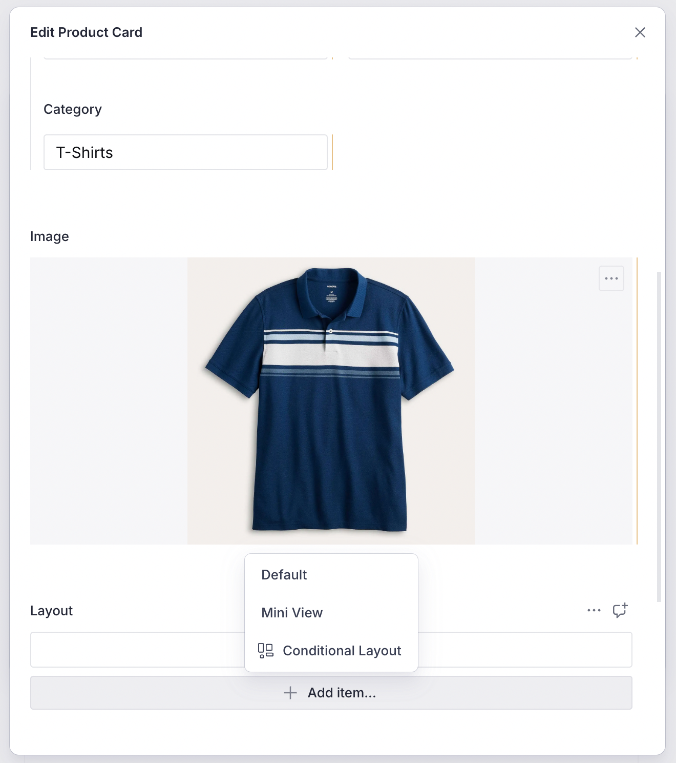
In this guide, let us add a custom layout for the ProductCard item created in the Content Types guide. The default layout for the ProductCard item looks like below.

1. Creating the Layout Schema
The schema for a mini-view layout configuration is simple. We will have a boolean to control whether the category should be shown:
export const productMiniViewLayout = defineType({
  name: `${ProductCardDescriptor.schemaType}.layout.miniView`,
  title: 'Mini View',
  type: 'object',
  fields: [
    defineField({
      name: 'showCategory',
      title: 'Show Category',
      type: 'boolean',
      initialValue: true,
    }),
  ],
  preview: {
    select: {
      showCategory: 'showCategory',
    },
    prepare(selection) {
      return {
        title: 'Mini View',
        subtitle: `Show Category: ${selection.showCategory ?? false}`,
      }
    },
  },
})
ContentDescriptor and ContentSchemaBuilder
A ContentDescriptor allows extending the capabilities of a ContentItem such as layouts and other types of custom configuration. An associated ContentSchemaBuilder for the content item collects all its descriptors and uses that to build the final set of configurations for the ContentItem. This assembly by the builder is also necessary to create the final master schema for the CMS.
2. Exporting in the FeatureDescriptor (CMS)
Export the layout in the FeatureDescriptor:
export const misc = new FeatureDescriptor({
  name: 'misc',
  title: 'Miscellaneous',
  contents: [
    new RouteDescriptor({
      regionItems: [{ type: ProductCardDescriptor.schemaType }],
    }),
    new ProductCardDescriptor({
      layouts: [
        defaultLayoutConfiguration(ProductCardDescriptor.schemaType),
        productCardMiniViewLayout,
      ],
    }),
  ],
  contentSchemaBuilders: [new ProductCardContentBuilder()],
})
TIP
The defaultLayoutConfiguration is a convenience method that creates a schema for a default layout. It uses the schemaType of the content as a prefix. For the ProductCard, it would be misc.productCard.layout.default.
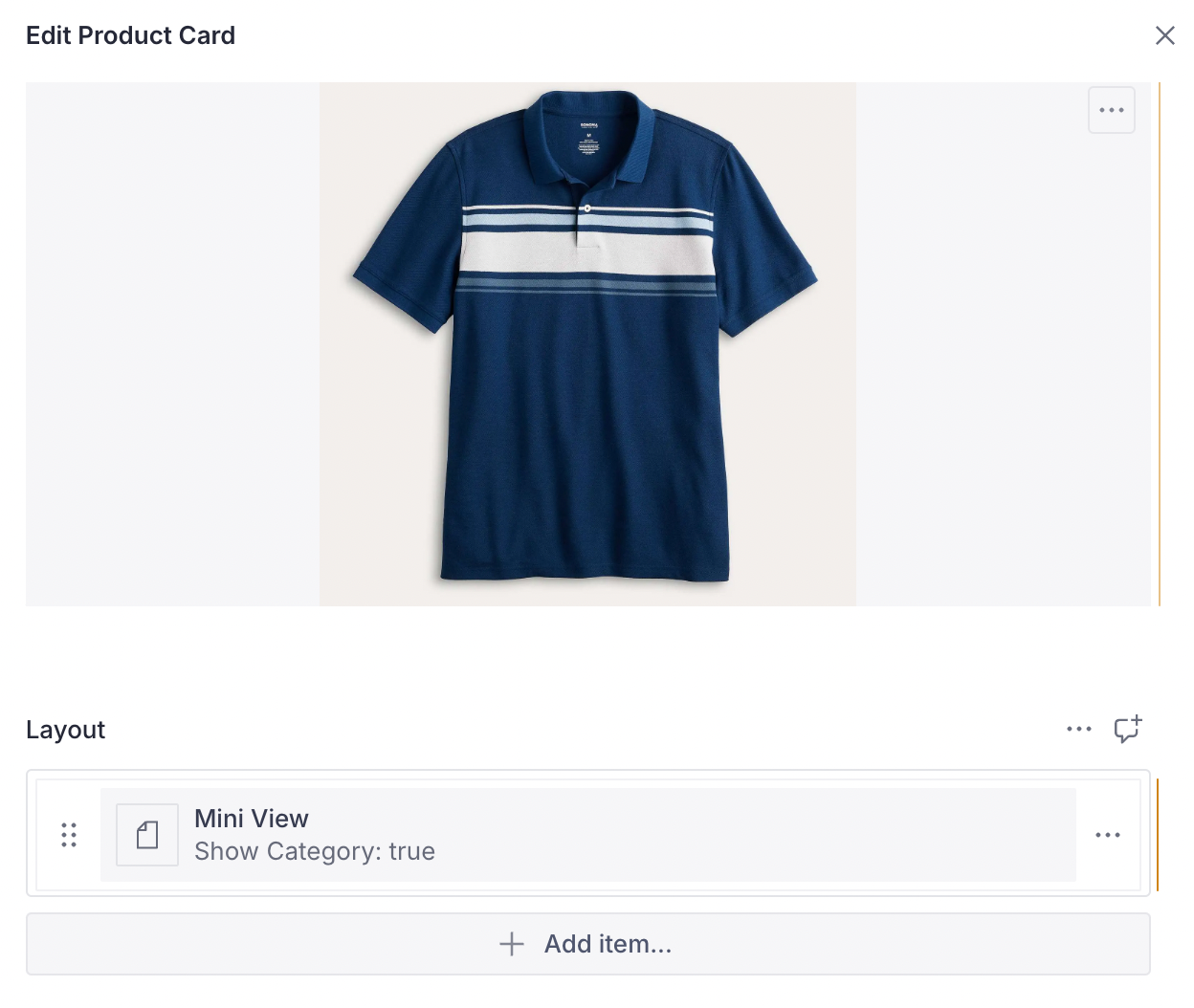
Now we have an option to choose this layout when creating the Product item in the CMS:
3. Creating the Dart LayoutConfiguration
The Dart counterpart for the layout is a type-safe version of the JSON schema:
@JsonSerializable()
final class MiniViewProductCardLayout
    extends LayoutConfiguration<ProductCard> {
  static const schemaName = '${ProductCard.schemaName}.layout.miniView';
  static final typeDescriptor = TypeDescriptor(
    schemaType: schemaName,
    title: 'Mini View Layout',
    fromJson: MiniViewProductCardLayout.fromJson,
  );

  final bool showCategory;

  MiniViewProductCardLayout({this.showCategory = true})
      : super(schemaType: schemaName);

  factory MiniViewProductCardLayout.fromJson(Map<String, dynamic> json) =>
      _$MiniViewProductCardLayoutFromJson(json);

  @override
  Widget build(BuildContext context, ProductCard content) {
    final theme = Theme.of(context);

    return Card(
      clipBehavior: Clip.antiAlias,
      child: Padding(
        padding: const EdgeInsets.all(8.0),
        child: Row(
          children: [
            if (content.image != null)
              ContentImage(ref: content.image!, width: 64),
            Expanded(
              child: Column(
                crossAxisAlignment: CrossAxisAlignment.start,
                children: [
                  if (showCategory)
                    Text(content.category,
                        style: theme.textTheme.labelSmall),
                  Text(content.title,
                      style: theme.textTheme.titleMedium),
                  Text('\$${content.price}',
                      style: theme.textTheme.bodyMedium
                          ?.apply(fontWeightDelta: 2)),
                ],
              ),
            ),
          ],
        ),
      ),
    );
  }
}
4. Exporting in the Flutter Feature
Include the layout in the FeatureDescriptor via the ProductCardDescriptor:
final feature = FeatureDescriptor(
name: 'misc',
title: 'Misc',
icon: Icons.miscellaneous_services_outlined,
extensions: [
ContentExtensionDescriptor(
contents: [
ProductCardDescriptor(layouts: [
DefaultProductCardLayout.typeDescriptor,
MiniViewProductCardLayout.typeDescriptor,
]),
],
contentBuilders: [
ProductCard.contentBuilder,
],
),
],
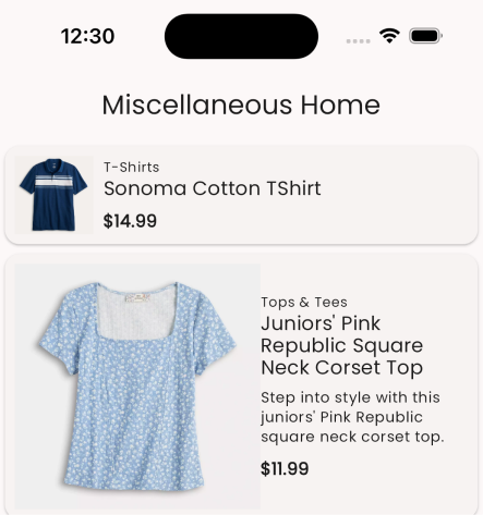
);By simply changing the layout on the CMS, you can affect the change on the app without any special deployment. Below you can see two product cards, each rendered with the mini and default layouts.
Default Layouts
Every content item inside the Vyuh Framework comes with a default layout. When you register a content item with the content builder, you specify this default layout. It is used when none is specified on the CMS.
static final contentBuilder = ContentBuilder<ProductCard>(
content: ProductCard.typeDescriptor,
defaultLayout: DefaultProductCardLayout(),
defaultLayoutDescriptor: DefaultProductCardLayout.typeDescriptor,
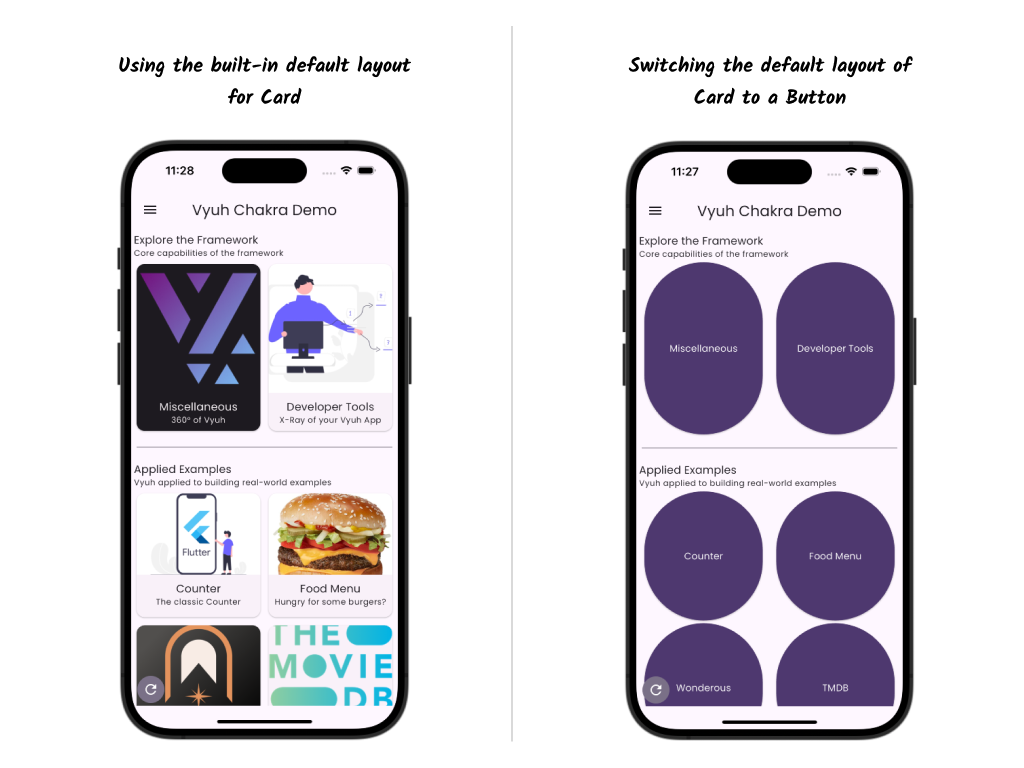
);Overriding Default Layouts
If you are building your own design system, most content items (including standard content items) may have a completely different appearance. Instead of explicitly setting this layout on the CMS for every item, you can change the default layouts programmatically.
You can do this inside your feature init() by listening to the SystemReadyEvent and swapping out all the default layouts:
final feature = FeatureDescriptor(
  name: 'root',
  title: 'Vyuh Root Feature',
  init: () async {
    vyuh.event.once<SystemReadyEvent>((event) {
      vyuh.content.setDefaultLayout(
        schemaType: Card.schemaName,
        layout: ButtonCardLayout(),
        fromJson: ButtonCardLayout.fromJson,
      );
    });
  },
  routes: () => [
    GoRoute(path: '/chakra', pageBuilder: defaultRoutePageBuilder),
  ],
);
TIP
In a typical application you may swap out several such layouts for the standard content items. It is a good practice to move all these calls to a separate file (e.g., default_layouts_override.dart) and invoke it from the feature init().
Default layouts can be changed with the vyuh.content.setDefaultLayout() method.
Summary
This guide showed you how to create multiple layouts for a ContentItem and how to manage default layouts. By simply changing the layout on the CMS, you can affect how content renders in the app without any code deployment. Under different contexts, different layouts are useful, and this capability is now available to you as you build more complex applications.