Designing Features
Designing a feature in the Vyuh Framework requires putting together a set of elements. This includes the following:
- APIs to talk to the backend to fetch data
- Experience layer that renders the widgets on the screen and provides user interactivity
- Distilling the Content Blocks that make up the feature
- Journeys which allow the user to navigate from screen to screen in exploring the content and interacting with it in different ways
- Design system components for a consistent experience
- Client-side State management to keep track of user interactions
- Analytics to track user interactions and understand user behavior
Universal Truth about Applications
Although we talk about the Vyuh Framework in this article, the set of things that you have to do for building a feature for an application is universally true and applicable across all applications.
Whether you use a low-code tool or a no-code tool, the set of things you have to do pretty much remains the same. The Vyuh Framework however makes it easier to manage both functional and non-functional aspects of building a feature. This allows you to grow from an MVP to the scale of a Super App!
Core Ideas
Some of the core ideas of building a feature are already discussed in a separate article on Features and Plugins. Make sure to take a look at that before reading further.
In this article, we will focus more on applying the Vyuh Framework to build a feature. This is all about distilling the feature in terms of its schemas, APIs, and experience widgets.
Distilling a Feature
A feature is essentially a collection of screens stitched together to form a journey. The content of each screen comes from a set of content blocks that you would design and configure from a CMS.
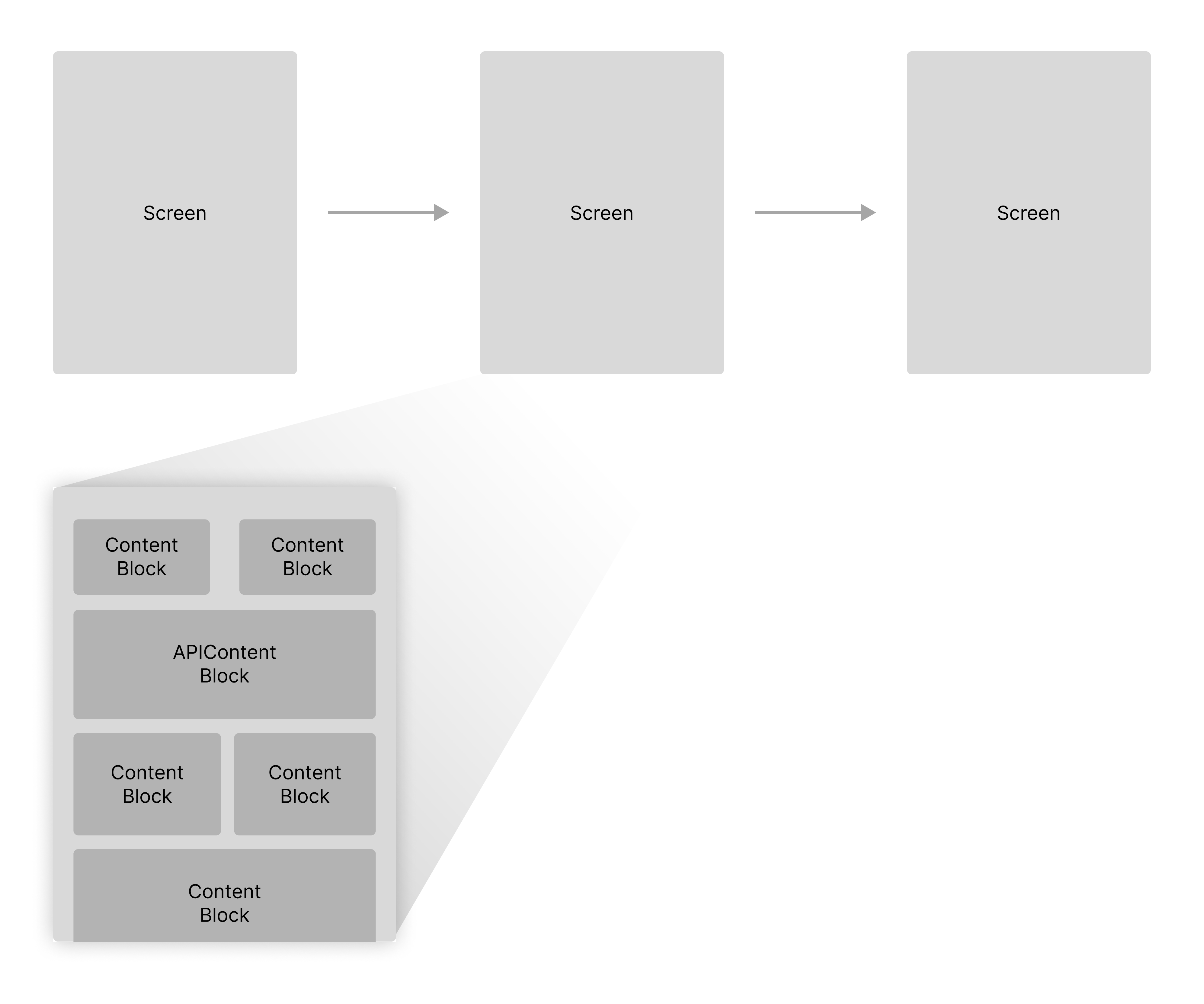
Now, it is possible that these content blocks may not have a CMS counterpart, and could be driven entirely from code. But for now, let us assume that we are designing features that are CMS-connected, which allows dynamic configuration and flexibility for business teams.
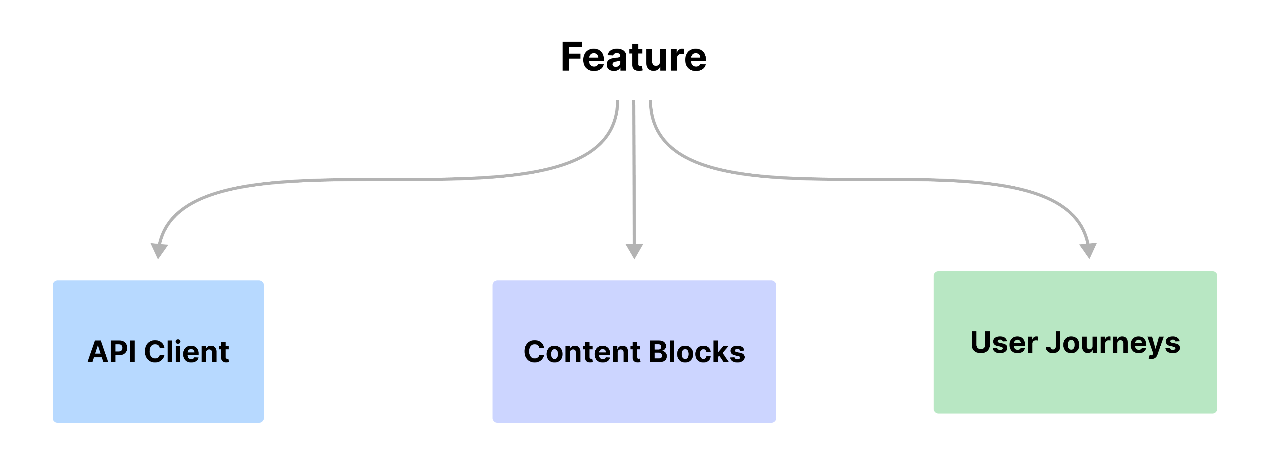
Thus, the three core building blocks of any feature include the APIs, the Content Blocks, and Journeys. Let us see each of these in detail.
APIs
APIs are the primary source of data for the feature. They could be REST APIs, GraphQL APIs, or even WebSockets. The APIs are responsible for fetching the data that is required to render the content blocks on the screen.
The APIs are also responsible for sending user interactions back to the server for processing. This could be a simple form submission or a complex interaction that requires a series of steps to be completed.
The Vyuh Framework has a built-in component for working with APIs, called the APIContent. This can be configured from the CMS, making it easier for the business teams to change the type of data source that should be used to drive the content on the screen.
Although we talk about APIs as the driving source of content for the content block, it is possible that the content blocks come directly from the CMS. In this case, they are configured on the CMS itself and rendered on the screen.
API SDKs
As you start working with more complex APIs and a large number of APIs, you will soon see a need to wrap all these APIs into an API SDK. The API SDK can expose an HTTP client that is used to fetch data from the server using semantic operations instead of talking directly to the endpoint URLs.
The use of the API SDK also hides the details of deserializing the response payloads and creating Dart objects out of them. Additionally, these API SDKs can be tested independently and made sure that they are robust enough to work under various conditions and request parameters.
When these APIs are commonly used across multiple features, the API SDK becomes the common package through which these features make those calls.
Content Blocks
While the APIs focus on fetching data from a remote endpoint, the content blocks are the key elements that allow you to render this data inside a screen. These content blocks have two counterparts:
- On the CMS where it exists as a schema, allowing business teams to configure it.
- On the Flutter side where it exists as a widget and possibly with the combination of other elements like state management, dependency injection, analytics, etc., which will all wrap together to provide the implementation for the content block. Here is where you would also apply the Design System to make the widgets visually consistent.
Design System as an SDK
The Design System, just like the API SDK, can be extracted into a separate package. This could be used across multiple features and even across apps if they are maintaining a similar visual identity.
It is a good idea to start building your design system (themes, colors, typography, icons, spacings, and the UI components) into a separate package so it becomes more reusable across features and apps.
Journeys
We have included journeys as part of a feature, which is purely from a customer's perspective.
However, when we work with the Vyuh Framework, we think of the journeys as not being hardcoded into the feature itself. Instead, they are defined and configured from the CMS. This gives the business the ability to change the journeys on the fly depending on the type of customer.
Externalizing the journeys is one of the key elements of the Vyuh Framework. With that, the features themselves only have to expose a set of content blocks, which are configured from the CMS. The business teams will use the content blocks to assemble pages and then stitch them together through a navigation journey.
Fixed Journeys
However, there are cases where a journey is so fixed in nature that it does not require a special type of configuration from the CMS. The payment journey is one such example.
Once you check out from your cart, the payment journey begins and accepts your payment method, then takes you to additional screens for more details, and finally completes the secure transaction. It then takes you back to the confirmation page. This journey can be hardcoded into the feature itself.
Some Handy Tools
A couple of tools that we have found useful when designing features:
- Icon fonts: Use Flutter Icon for generating the icons that you need for your feature. This is a great way to keep your app size small and also have a consistent set of icons across the app.
- Theme Builder: Use the Material Theme Builder to quickly crank out the theme for your next app or feature.
Summary
This guide has provided a set of tips for designing your features by identifying its core components. By applying these ideas you can even make features that work across a family of Vyuh apps.